The symbols of antiquity surround us. Elegant, rude, ornate – many of them have already firmly entered our life, but are still covered with a veil of secrecy. If you are one of those people who are enthusiastically immersed in research, who are ready to learn the vast mountains of information in order to get to the bottom of the truth, then congratulations, this article is for you. (If you are not, check essaylook.com) We have already collected all the necessary information for you and you just have to sit back and read a clear structured material.
If someone thinks that an ampersand appeared in the last century or even before last, then he or she is deeply mistaken. In fact, this "miracle" appeared before the birth of Christ, that is, in the period B.S. The sign was invented by none other than Mark Tullius Tyrone himself, the former slave and then the best friend of Cicero, who wrote his biography, a collection of his sayings and even anecdotes. And this man was the main developer of the Roman shorthand.
Solemn Entry into History
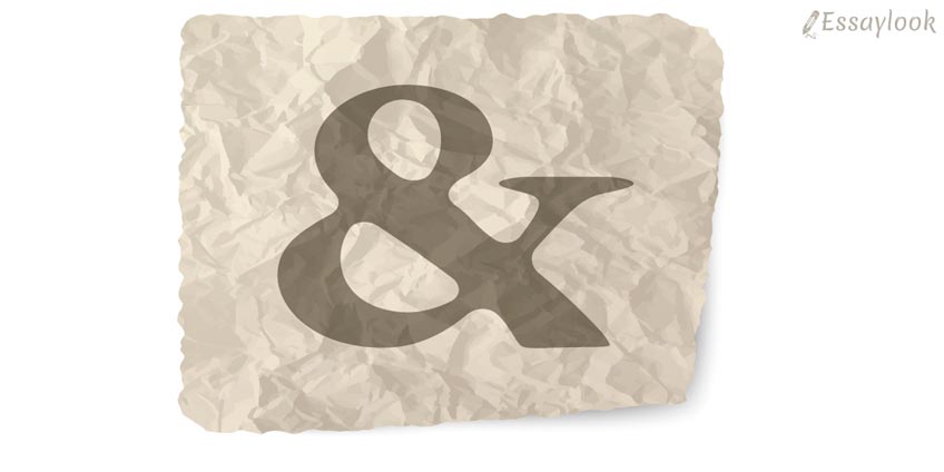
According to official sources, the logo "&" was published before the word corresponding to it. Around the I century A.D. Roman chroniclers adhered to the tradition of combining several letters into a single ligature, one of which, being the 27th alphabet’s letter meaning "et" ("and"), became the prototype of the ampersand.
The sign got the second birth in the VIII century when it was actively used when copying books and manuscripts. And since the XV century it was already used not only in Latin but also in England, France, Italy. It found its habitual appearance in the Renaissance.
The first versions of this sign did not look like a modern icon. But the time was passing, the printing and printing house were actively developing, and the symbol was changing with it. And the present sign is quite unlike its ancestor, to whom it owes its existence.
The very notion of "ampersand" owes its origin to a phenomenon known as a mondegreen, or an incorrectly heard word, which is based on the formation of a new word as a result of an incorrect pronunciation of the old one. In the XIX century, schoolchildren of Great Britain, studying the alphabet, read: "... X, Y, Z and per say &" – the last phrase ("and then et") was intended to emphasize the independent status of the logogram following it. Soon the indistinct pronouncing of this phrase led to the fact that & was first excluded from the alphabet, and subsequently, first appeared in dictionaries in 1837.
The ampersand can look different in different fonts, but its meaning remains the same in all cases – the "et" union.
Modern Use of Ampersand
This symbol has firmly established itself in modern culture. Most often it is used in the official or business headings of law firms or restaurants and high-end stores. This is a kind of binding seal, signifying a permanent and long-term partnership.
You can find whole websites that are dedicated to this sign on the Internet. And there are many people around the world, who like to decorate their house with objects with the image &, which can be depicted on pillows and blankets, on slippers, a cosmetic bag, a plate. And especially ardent adherents are ready to wear jewelry that exactly resembles the symbol & even bake original buns of the same shape.
But & is not only used by creative designers and advertisers. This symbol can still be seen in programming, particularly in languages such as XML, BASIC, MySQL and SGML. Also, it is found in mathematics in the meaning of logical "and" – conjunction, union. Often & is used in communication on the Internet: usually instead of the "and" union in text messages and on Twitter.
When specifying authorship, & indicates that the authors have worked together on the project, and it means that the authors may have worked at various times or the second author only rewrote the work of the first one.
This symbol can play an important role in design. In printing, using this sign in titles will add a graphics to an article or text, especially if there are no images in it. This improves the appearance of the text and its perception. The italic version of the symbol will add elegance to the design.
